Brand Direction

Effortless
A sense that everything is already taken care of simple, smooth, and stress-free from discovery to celebration.
Timeless
A feeling of confidence in the brand, grounded, established, and built to last beyond trends or temporary hype.

Elegance
An atmosphere of quiet luxury, refined, composed, and sophisticated without being intimidating.
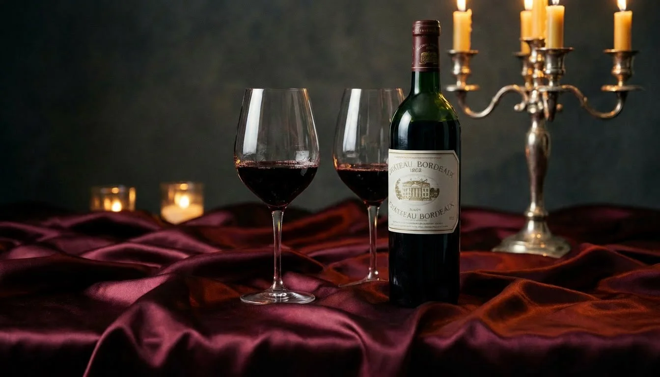

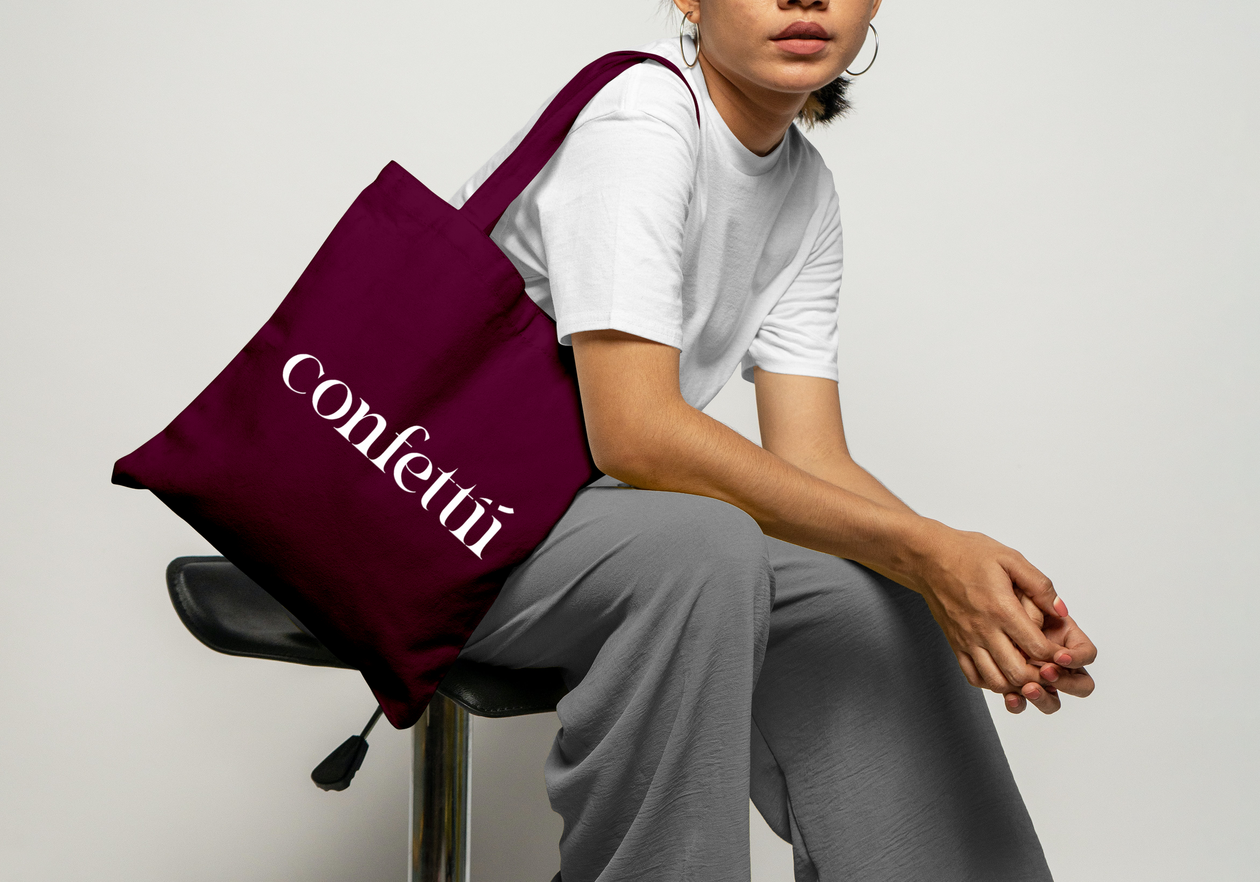
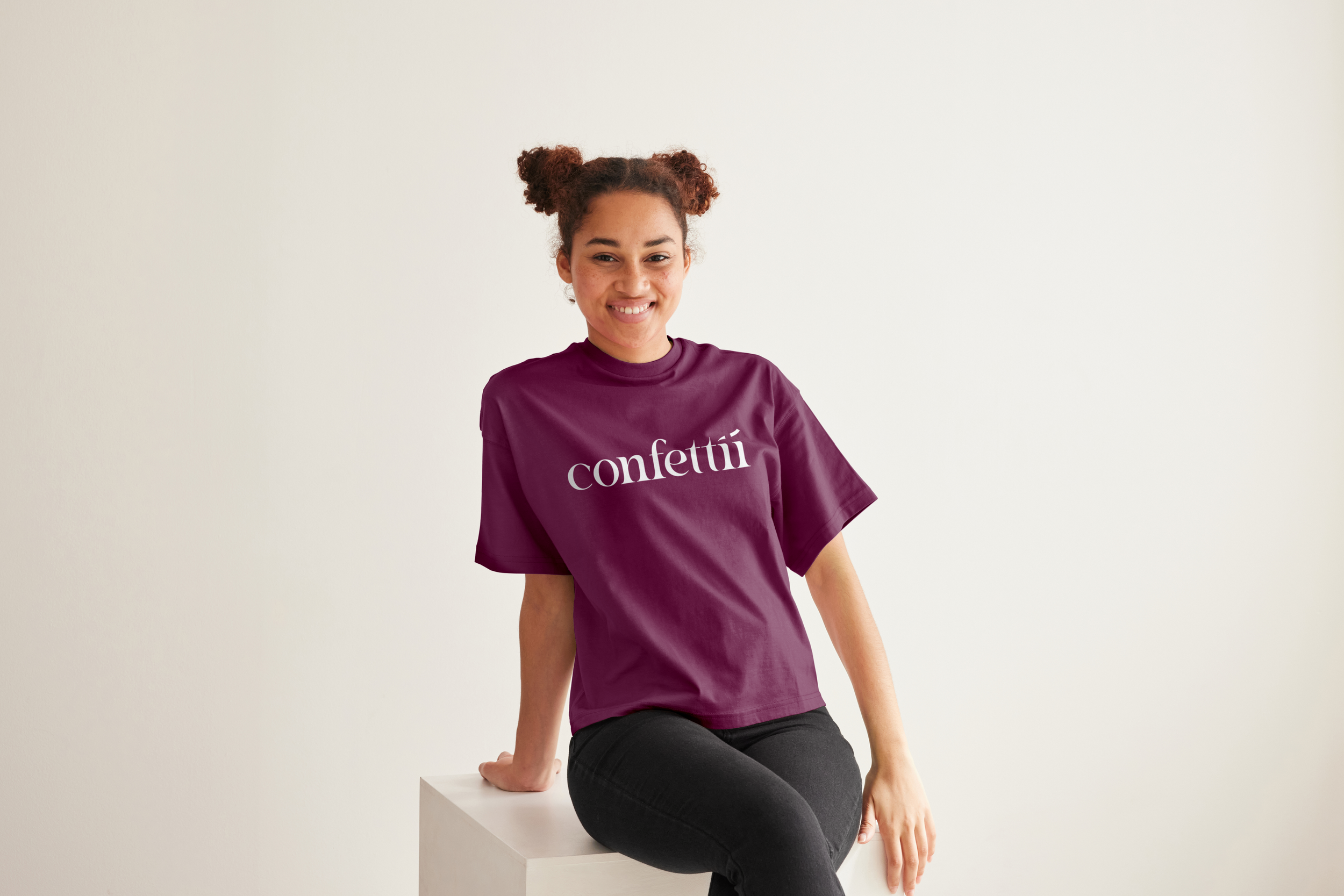
Bordeaux
Used to anchor the identity and create strong visual presence. It highlights key elements across the brand while reinforcing a refined and premium atmosphere.
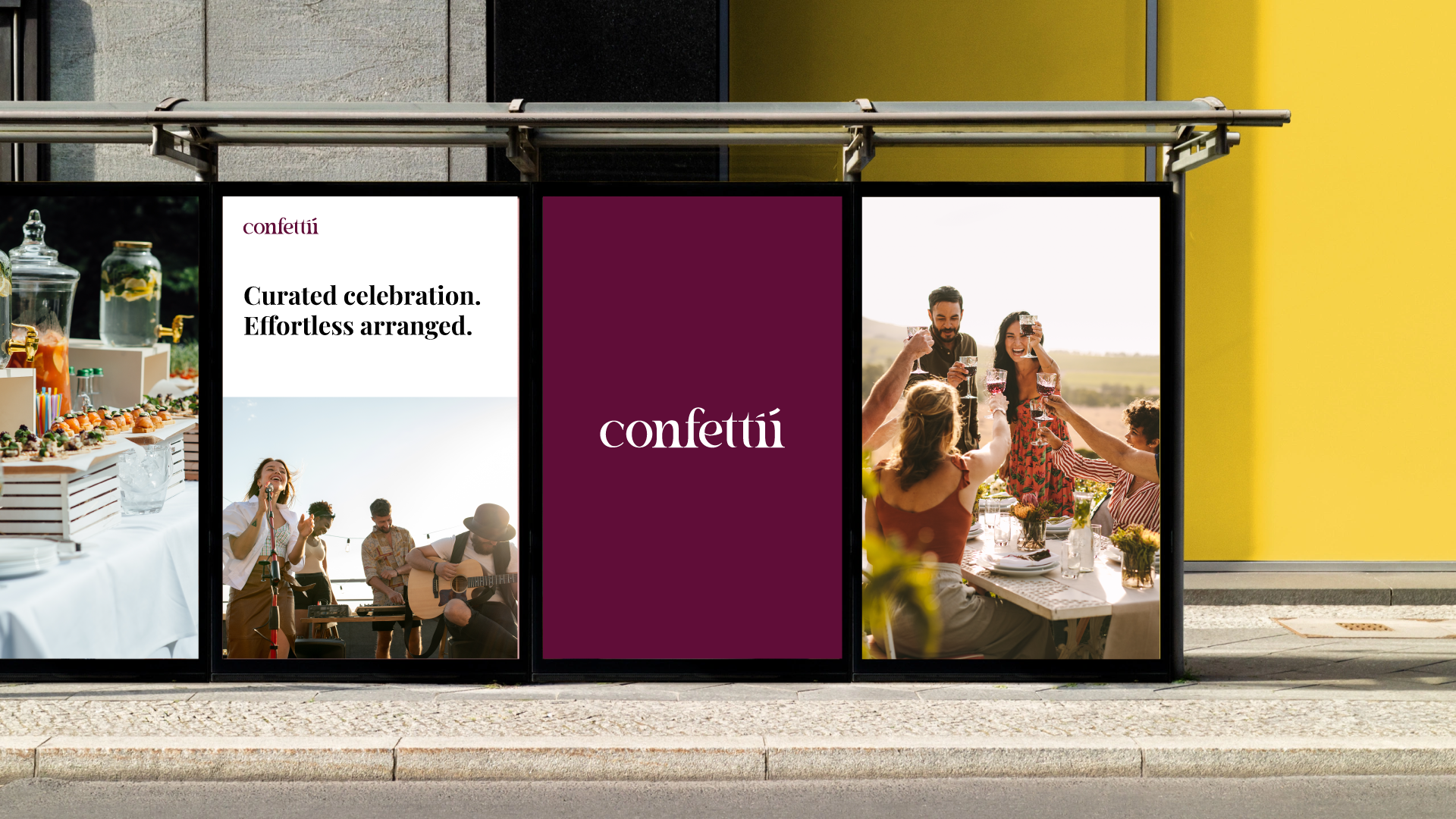
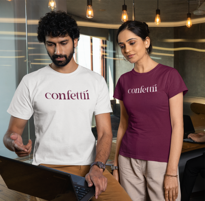
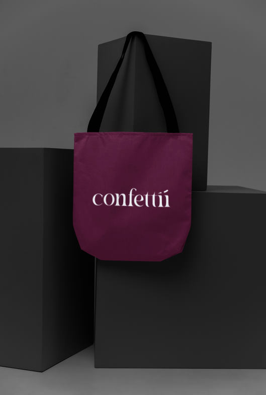
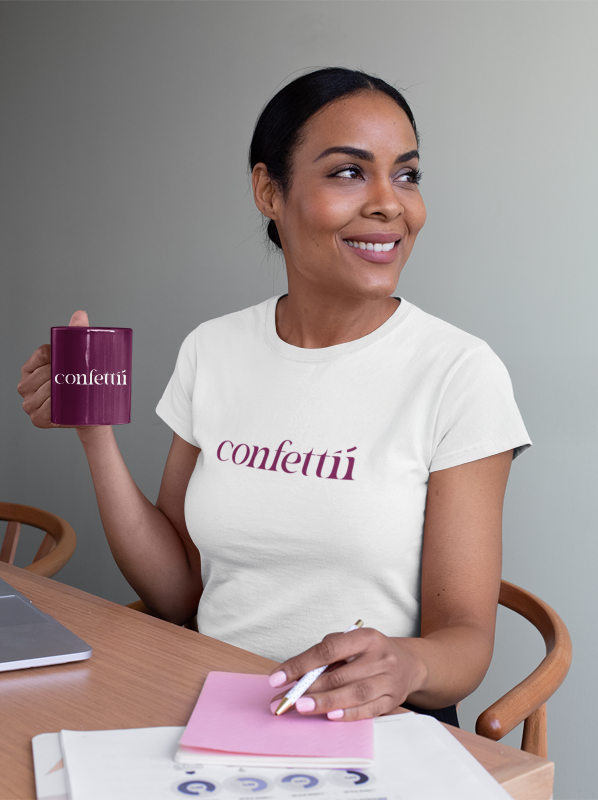
BORDEAUX: Brand Color
White
Used as the primary background to create space, clarity, and contrast. It keeps the interface clean and allows content and imagery to stand out.
WHITE: Base Color
BLACK: Functional Colorblack
Used for text and essential UI elements to ensure readability and clear information hierarchy.

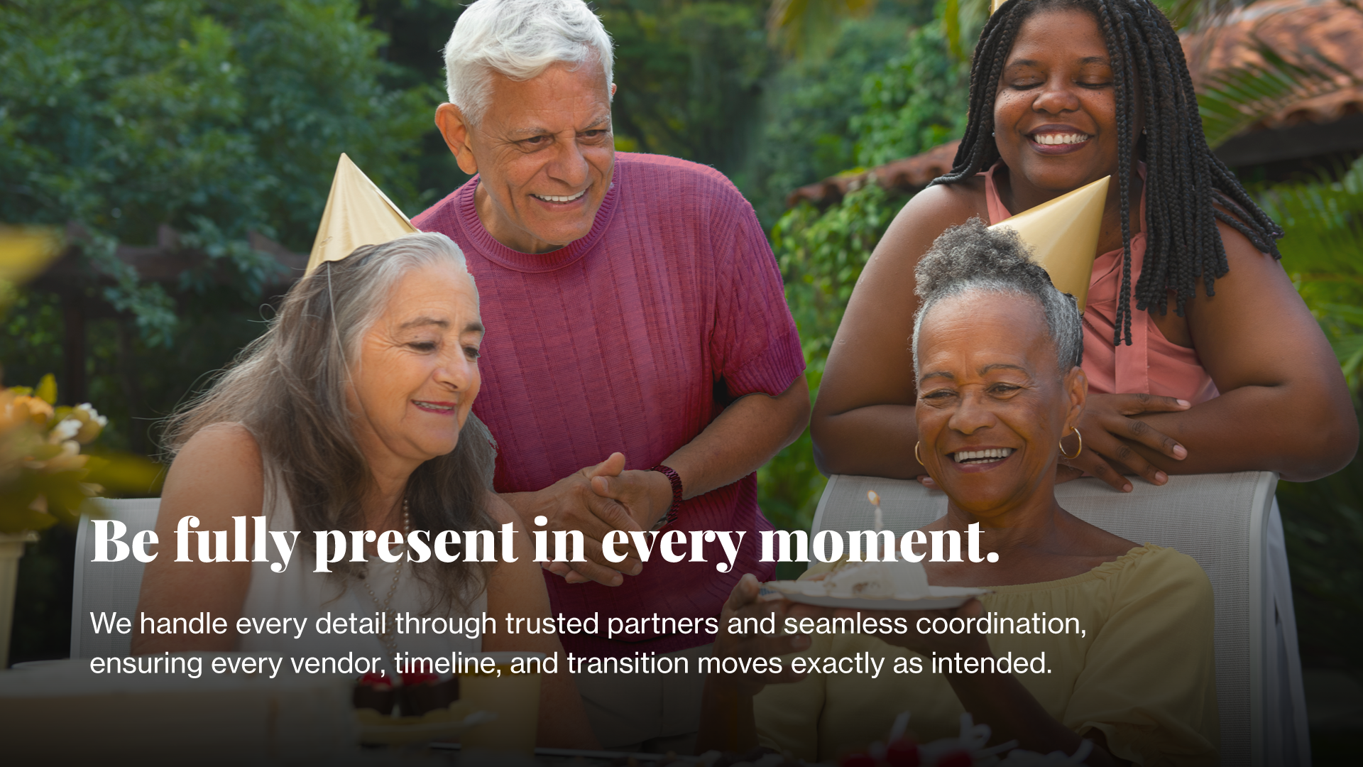
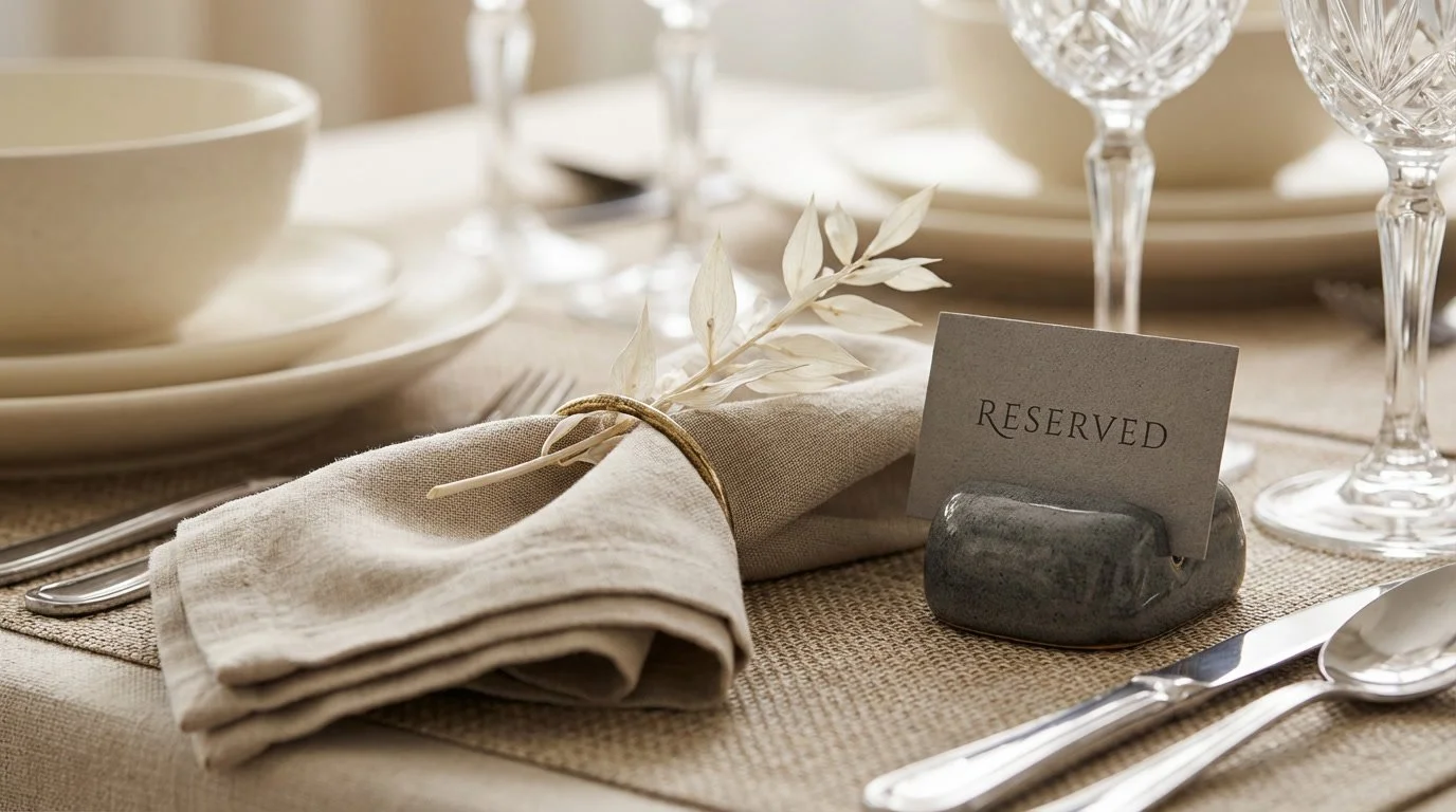
Social Media: Design
Information, Explanation, Announcements
When to use:
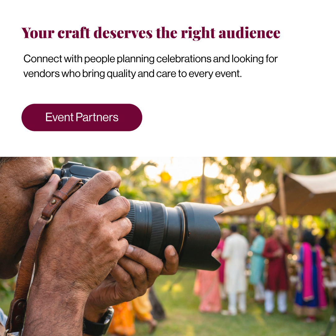
Explaining Conffettii’s process, packages, or features
Highlighting new services, vendor partnerships, or updates
Sharing announcements or educational tips
Tone & Style:
Clean, minimal layouts aligned with brand colors (Bordeaux, white, black, subtle accents)
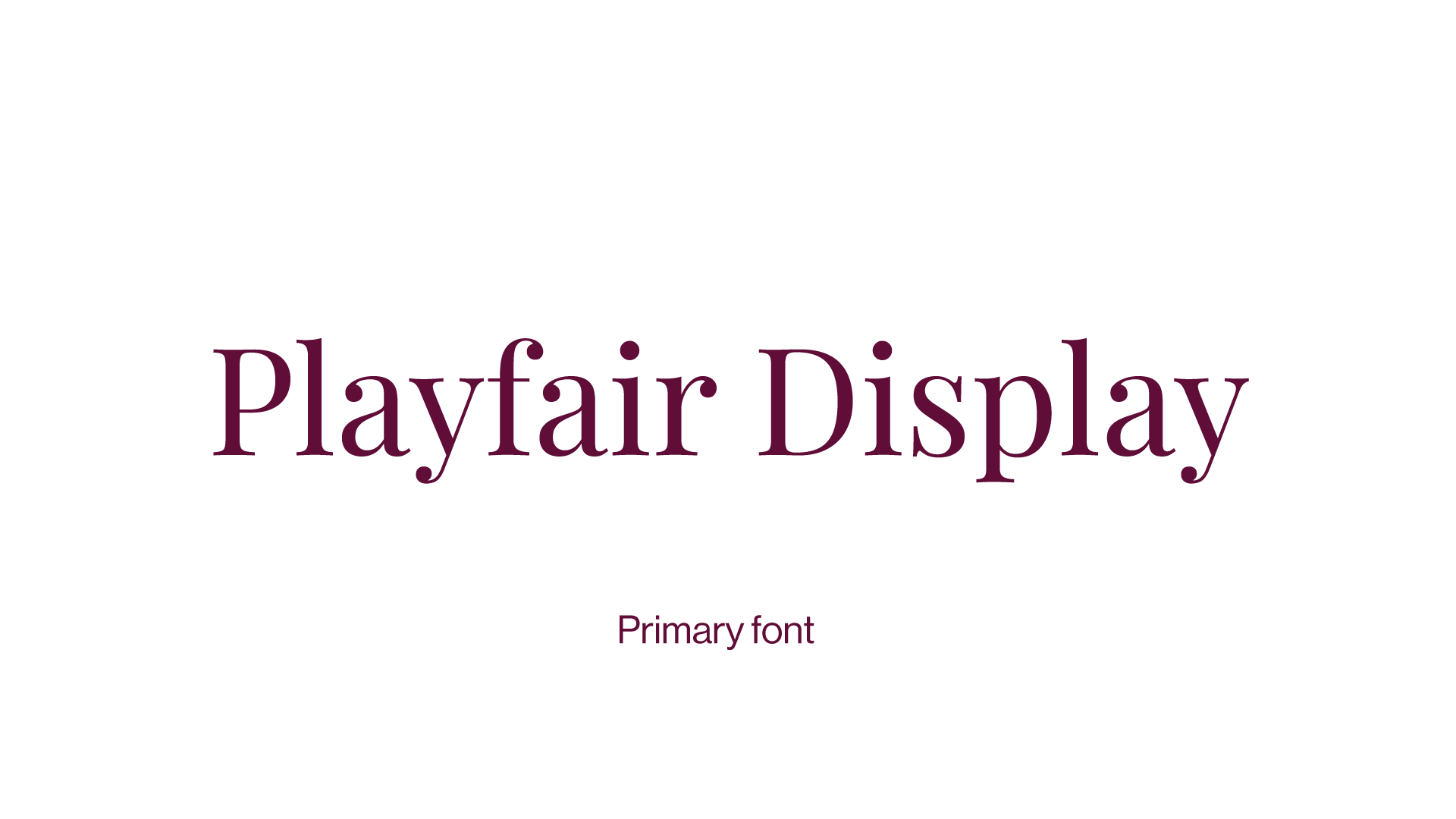
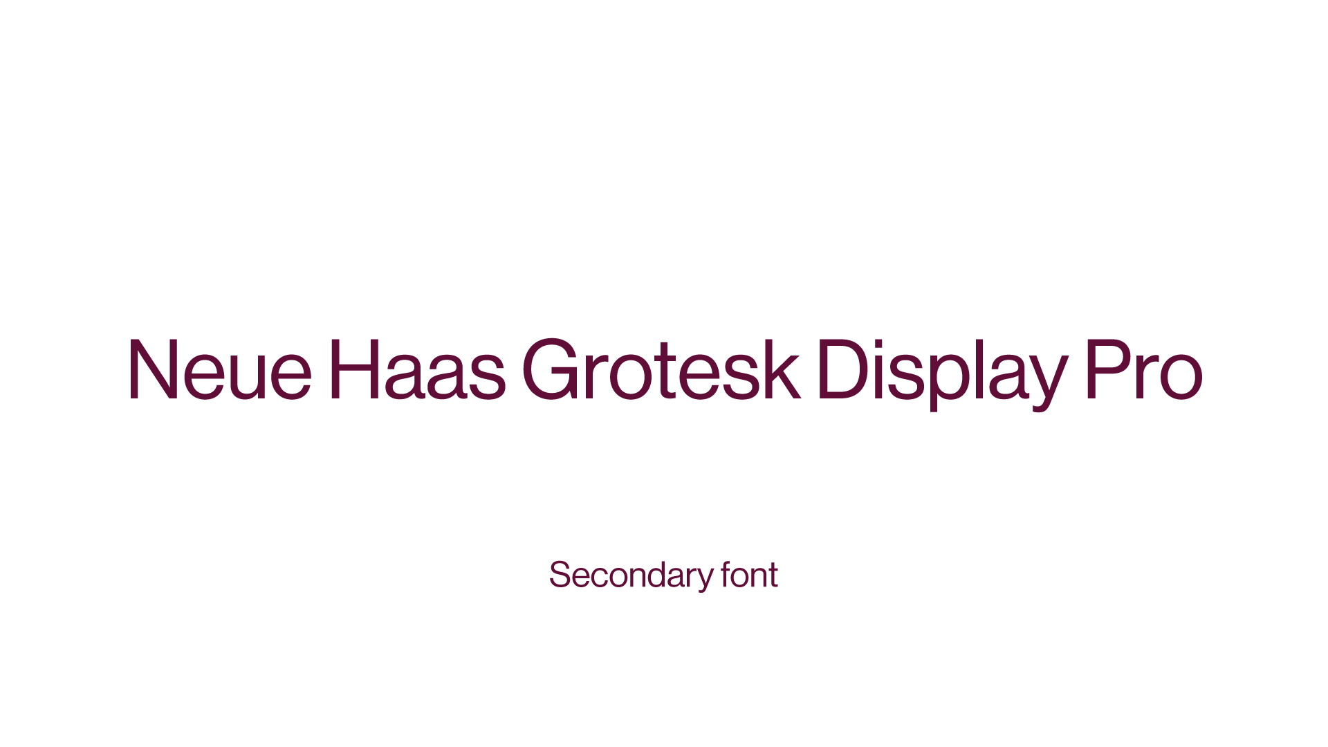
Structured, easy-to-read typography (Playfair Display for headings, Neue Haas Grotesk Display Pro for body)
Focus on clarity, hierarchy, and readability
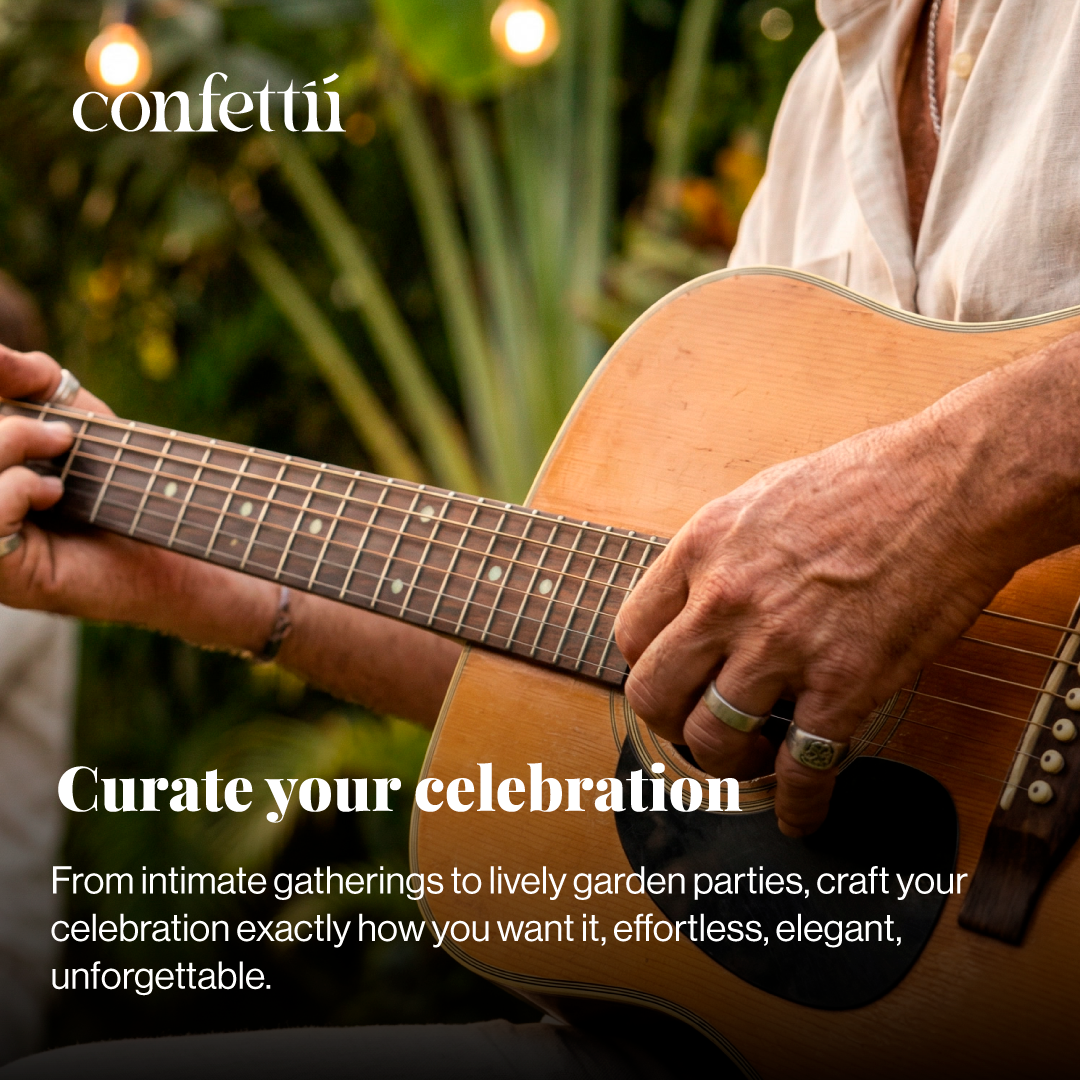
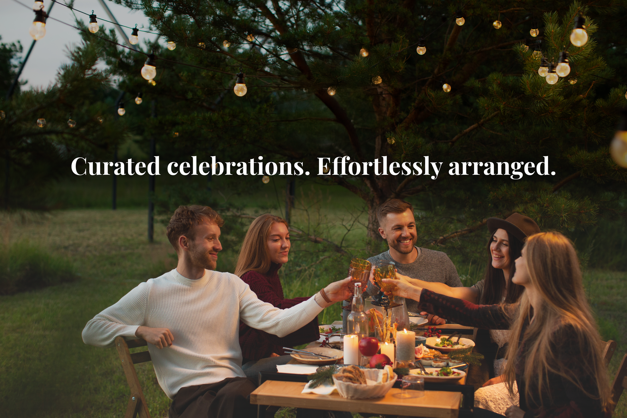
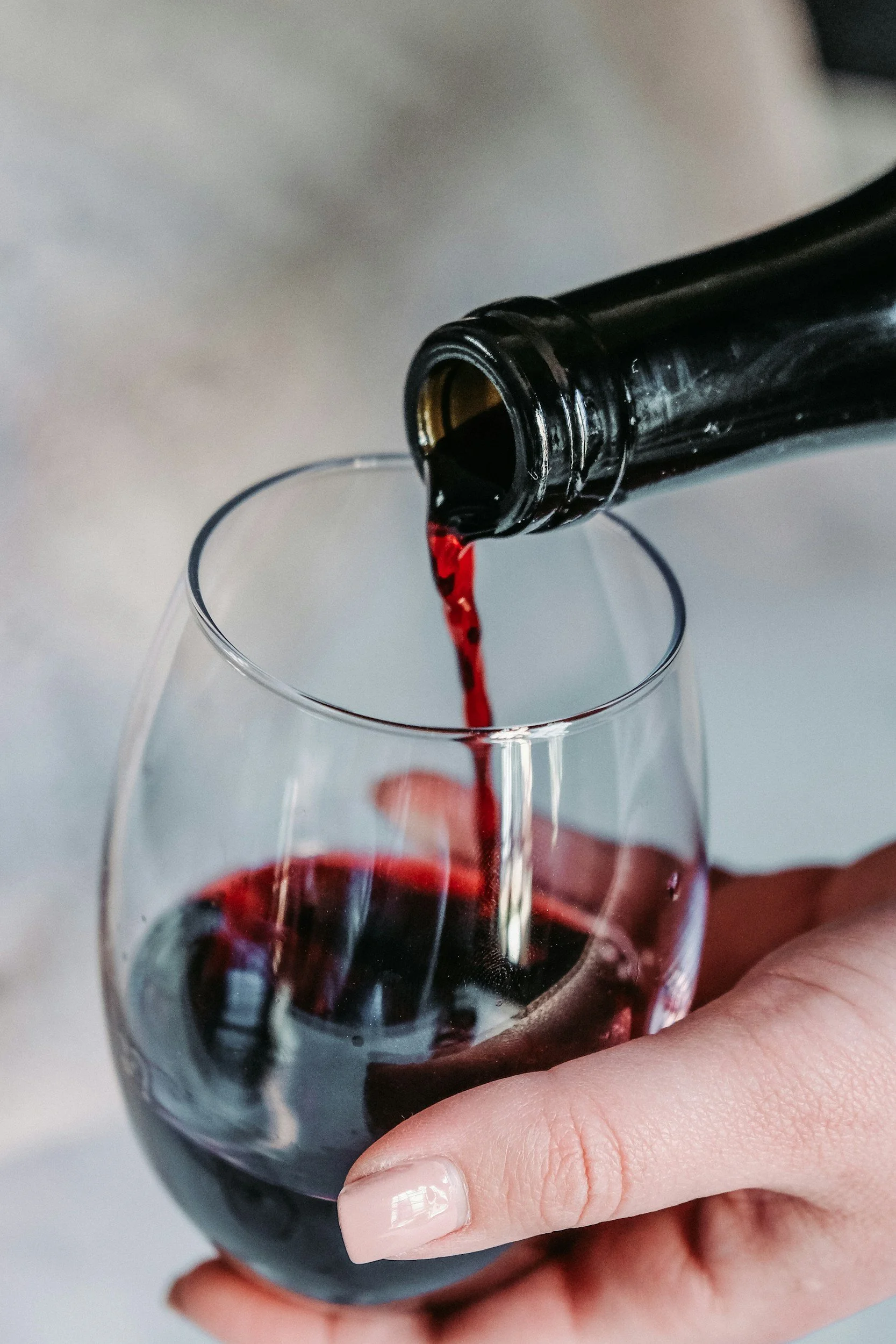
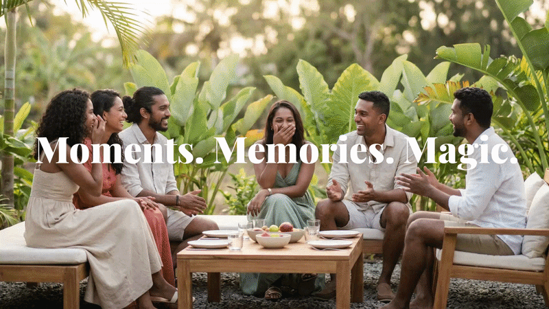
Social Media: Image-Only Posts
Emotion, Proof, Aspiration
When to use:
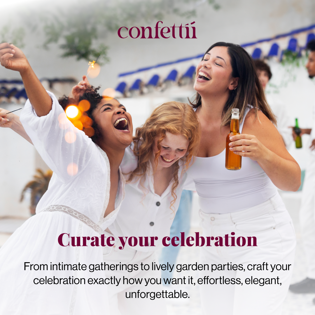
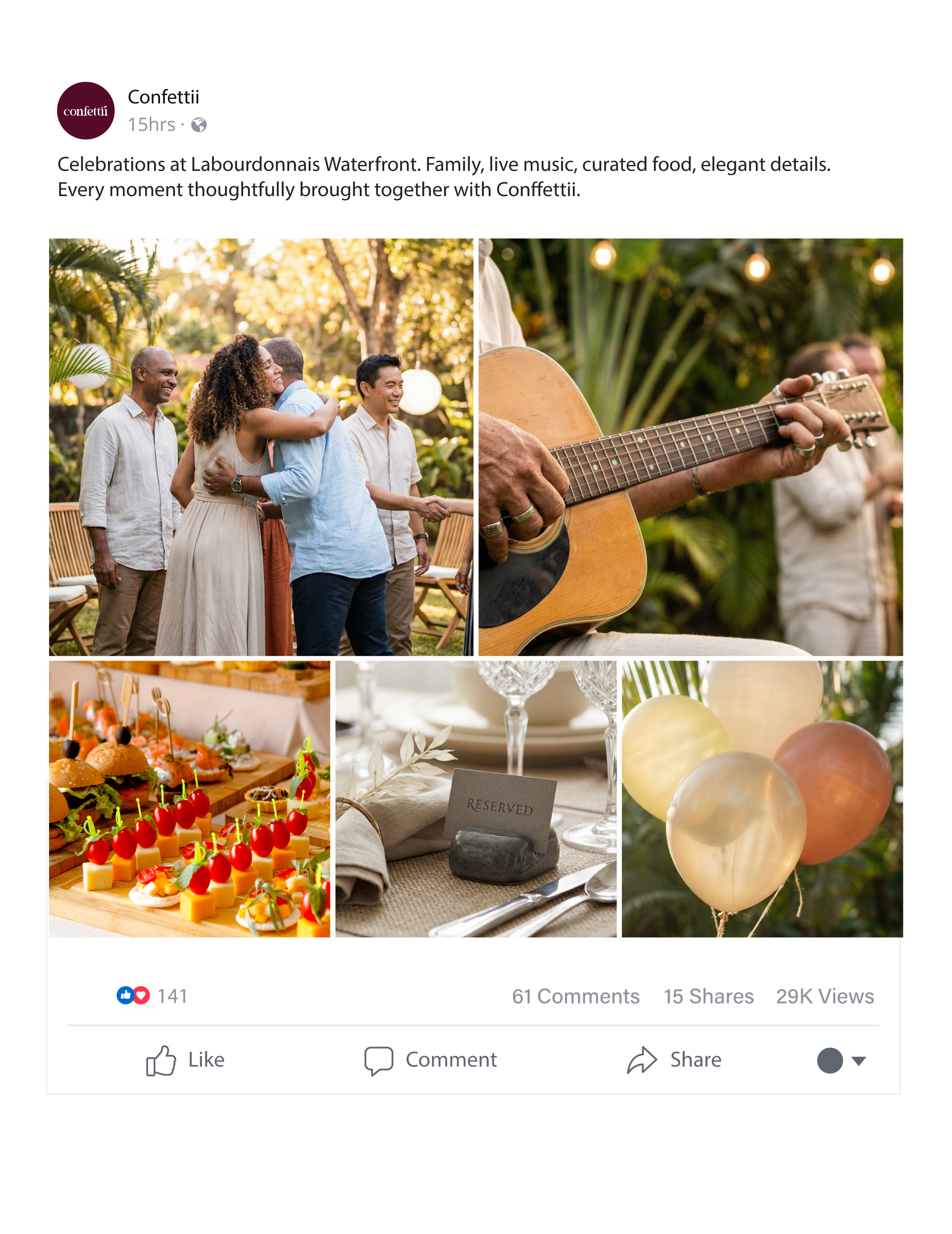
Capturing real events (parties, setups, cake, venue)
Showcasing the atmosphere & experience
Highlighting social proof (happy moments, celebrations)
Creating aspiration and desire for the Conffettii experience
Tone & Style:
Realistic, cinematic, or editorial photography
Clean, bright, and premium feel
Minimal or no text overlay
Focus on emotion, mood, and storytelling