FROM FARM TO CUP
Building a bold, eco-friendly brand that speaks to a new generation of coffee drinkers
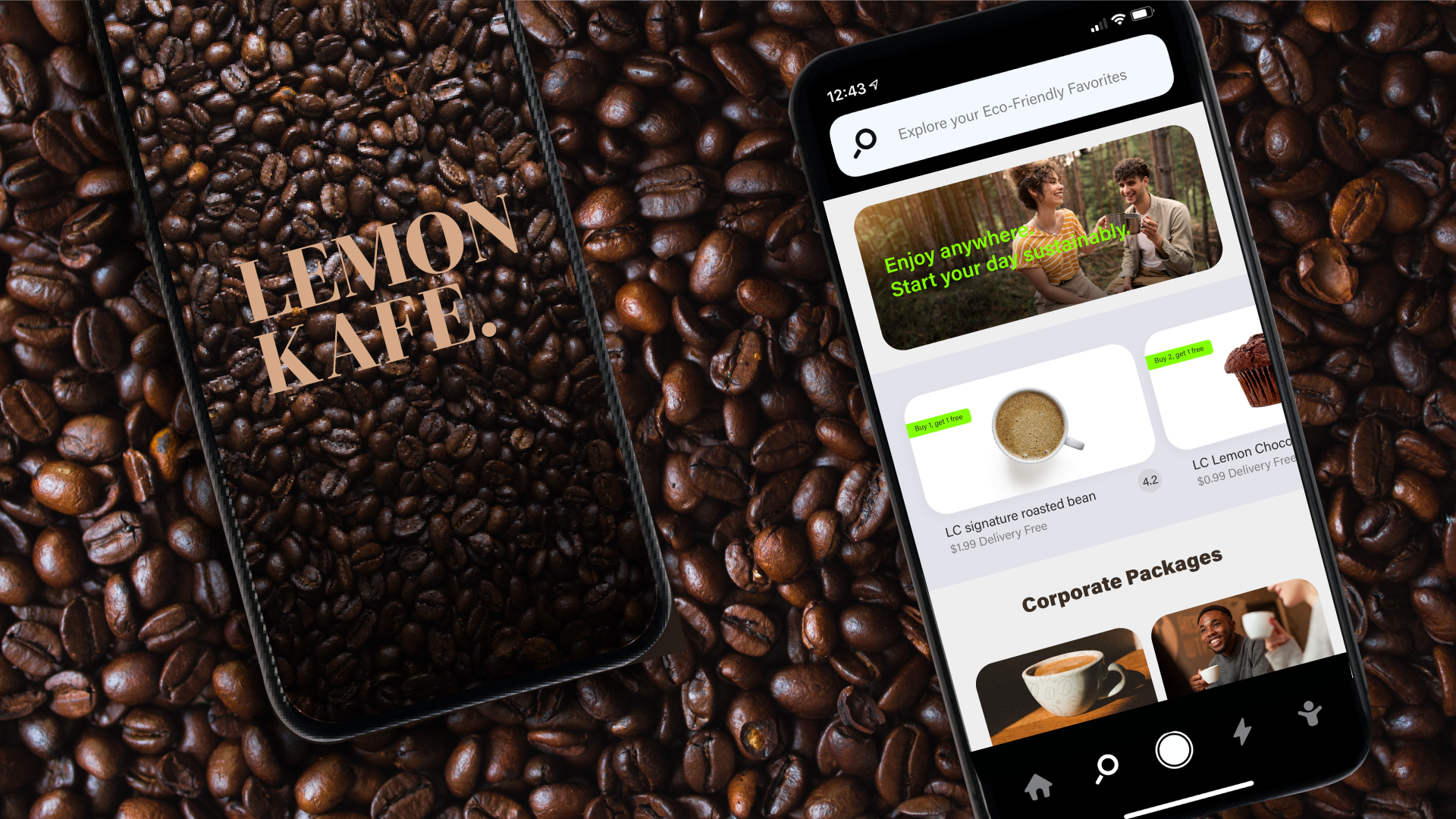
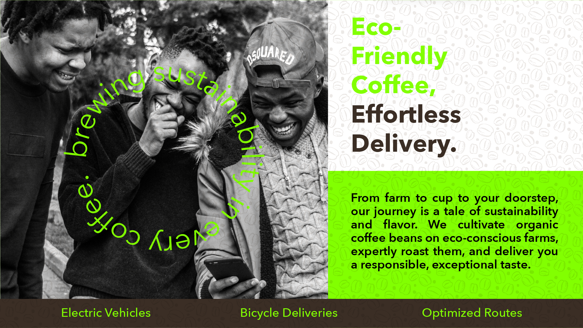
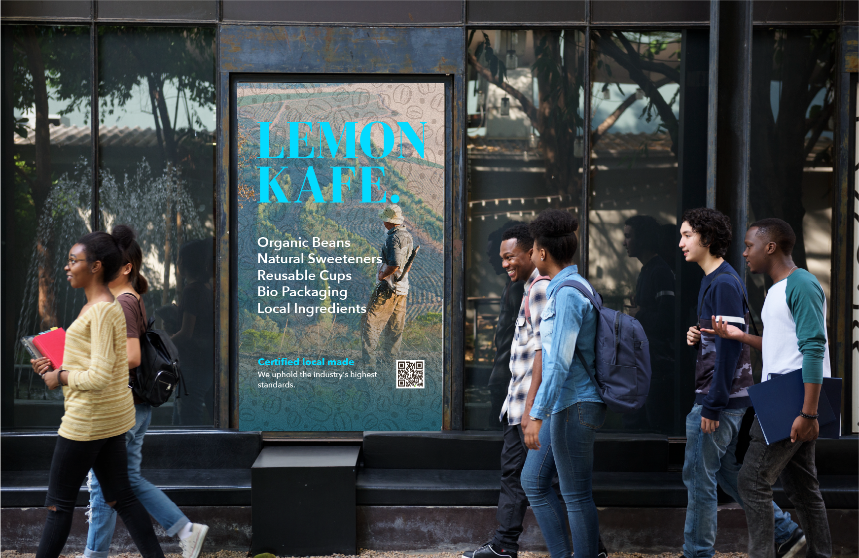
Lemon Kafe is a small-batch coffee shop in Kingston, Canada, founded with a mission to serve ethically sourced coffee through a brand that feels bold, youthful, and eco-conscious. I developed a full visual identity, from brand language and packaging to digital touchpoints, balancing clarity and usability with vibrant, feel-good energy.
The goal was to create an experience that felt uplifting and intentional, making people feel free, energized, and part of something positive and sustainable.
Partner
Lemon Kafe
Role
- Defined the color system, typography, logo, and pattern
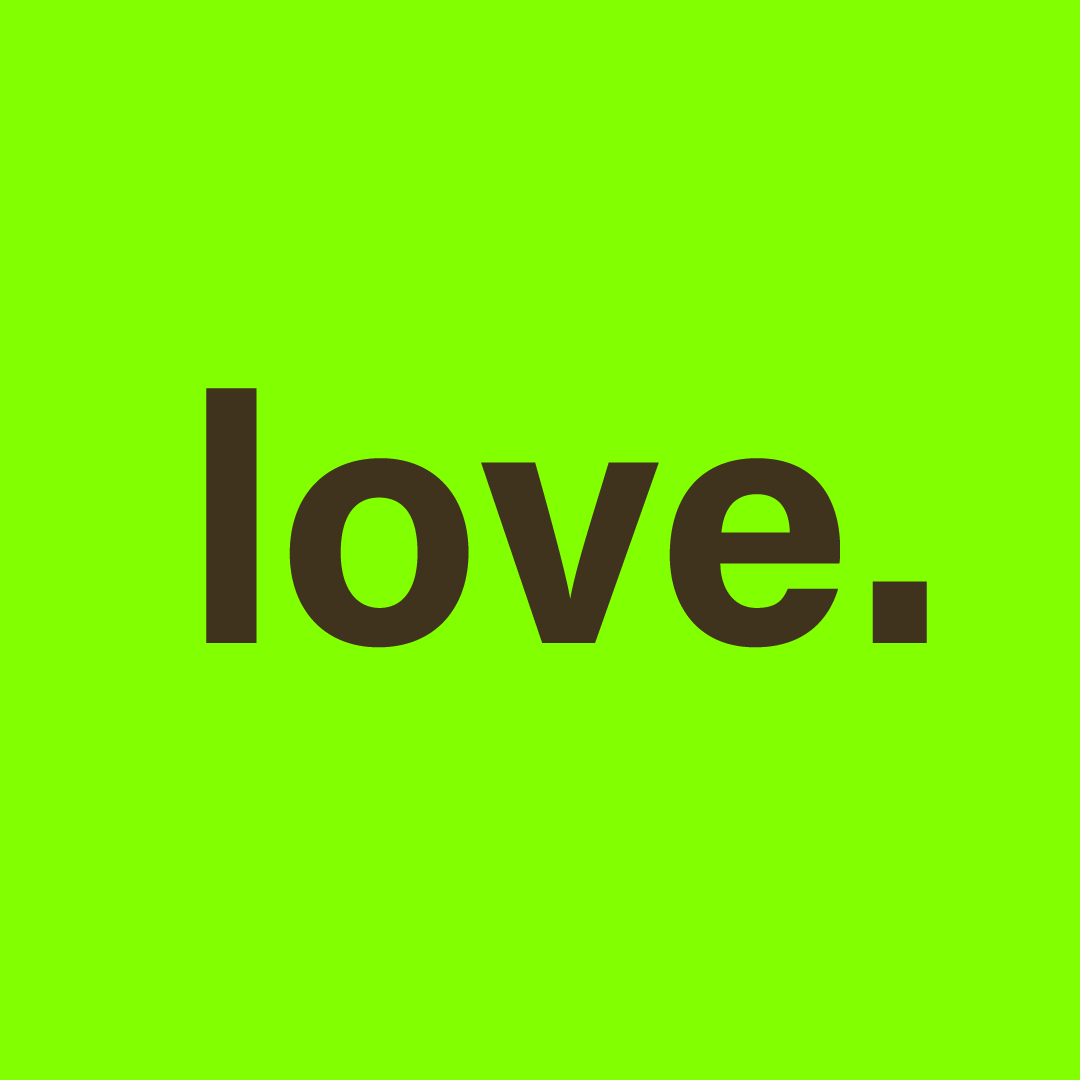
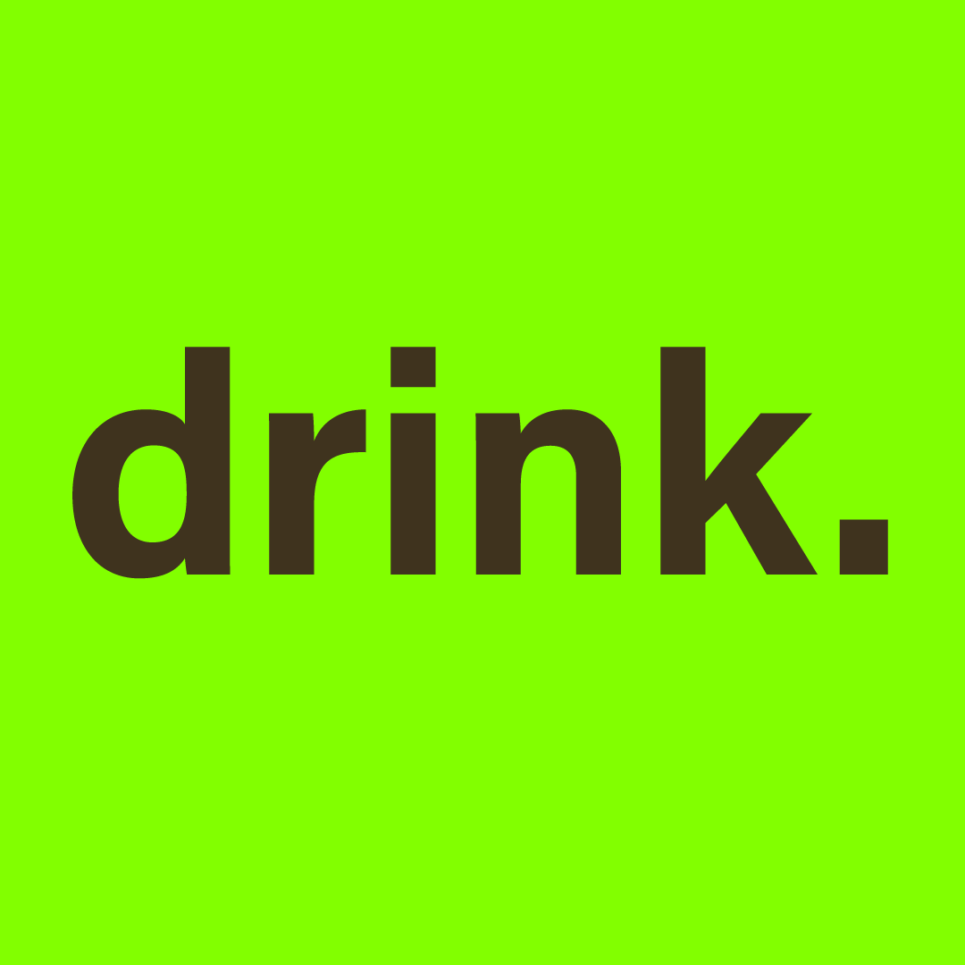
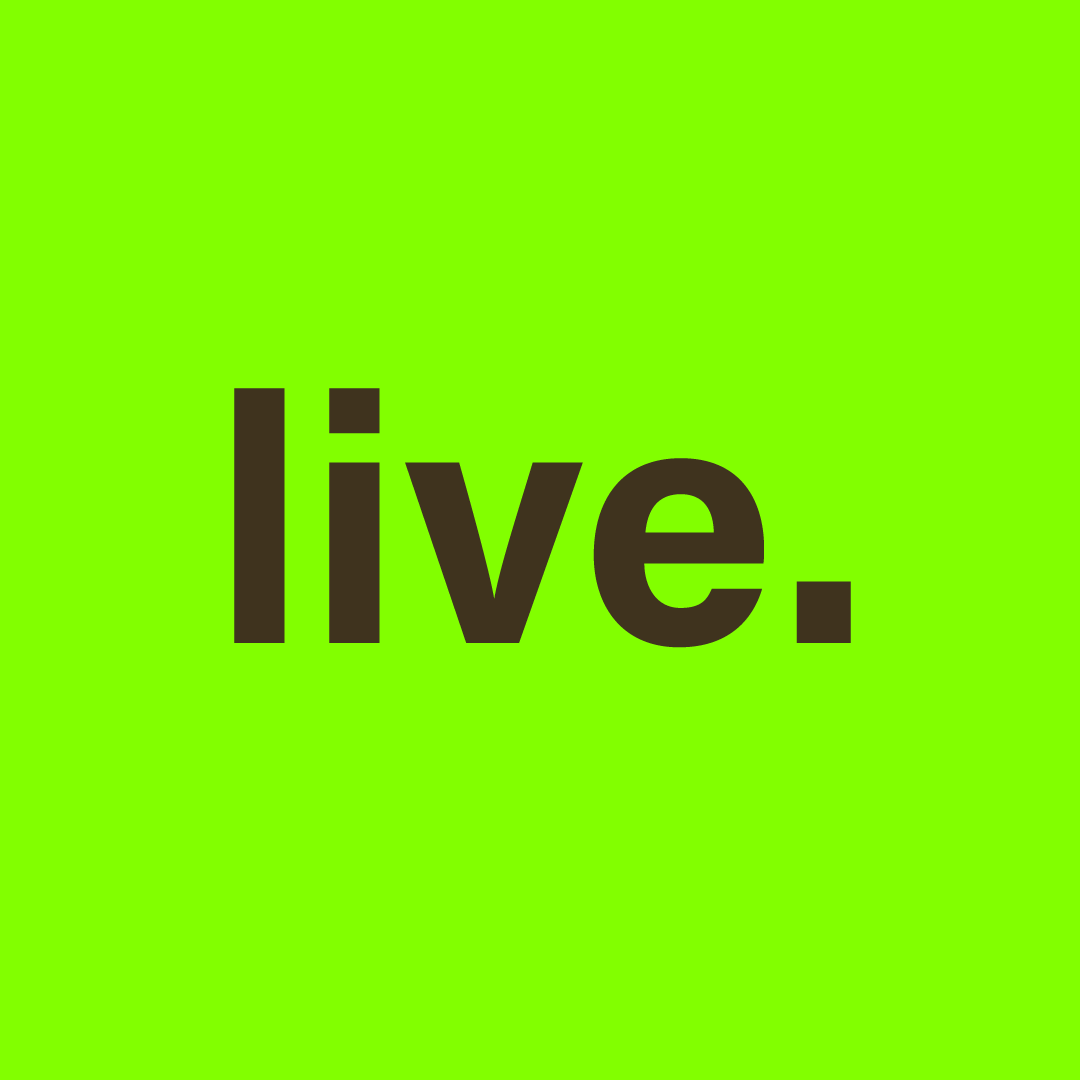
- Built the brand's voice using clean, organic language
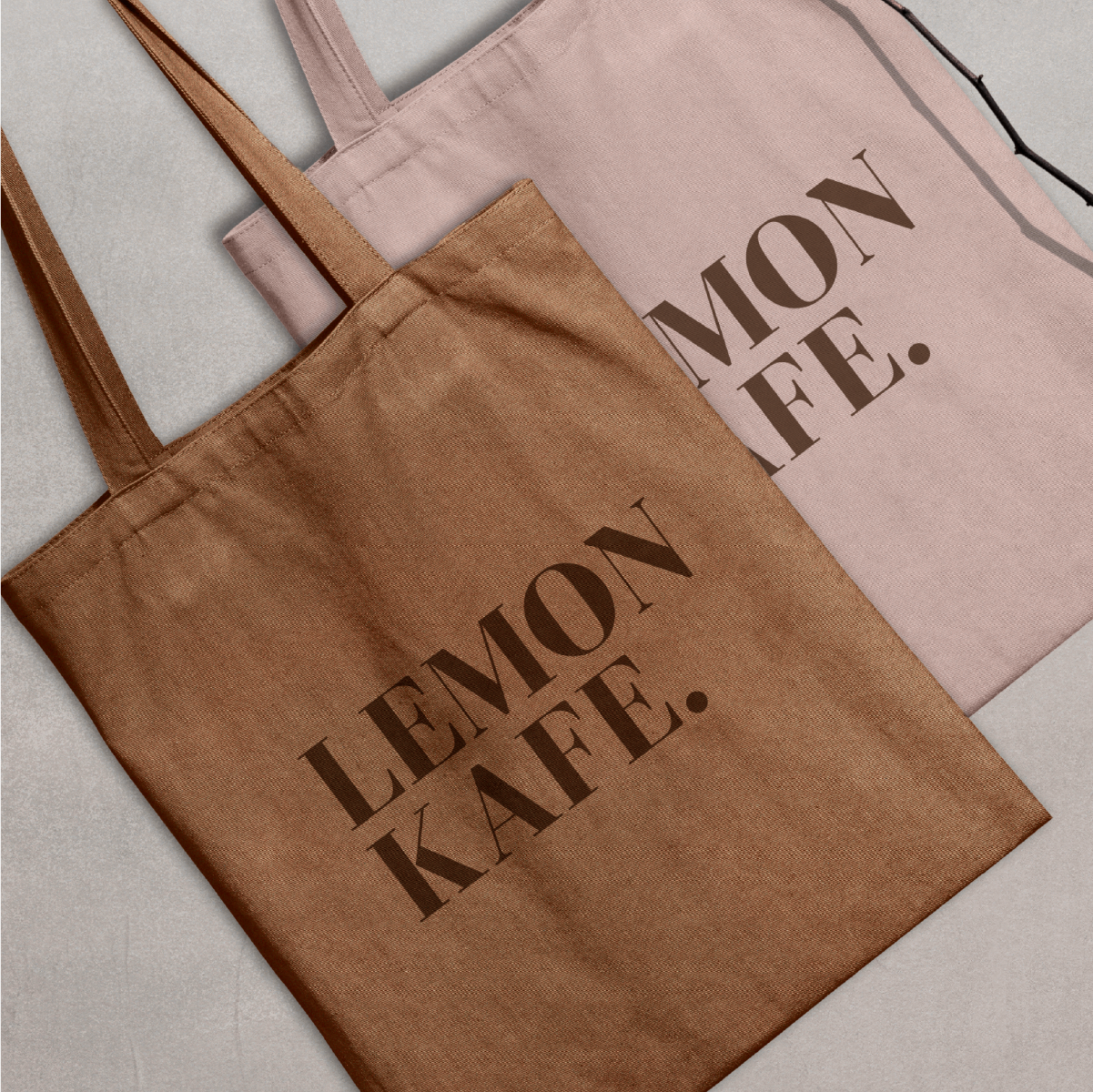
- Designed visual applications for packaging, signage, and social medi
The Problem
Eco-conscious brands often lean toward safe, neutral tones and overly serious messaging. Lemon Kafe wanted to challenge that. They needed a brand that captured their values — sustainability, quality, and community, but did so with confidence, playfulness, and bold personality.
The goal was to design a system that felt modern and memorable while staying rooted in ethical and environmentally friendly practices.
Research
& Constraints
To define Lemon Kafe’s space, I looked into:
- Common themes in eco-conscious branding
- Visual styles that appeal to younger, urban audiences
- The balance between boldness and credibility in sustainable product design
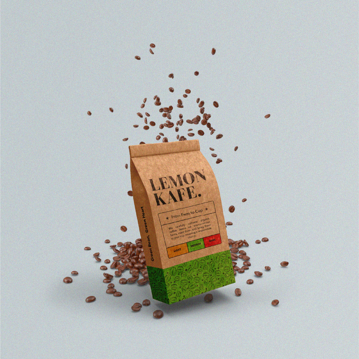
I also audited local and global coffee brands to avoid overused visuals like kraft paper textures and muted tones.
The goal was to disrupt that space while staying authentic.
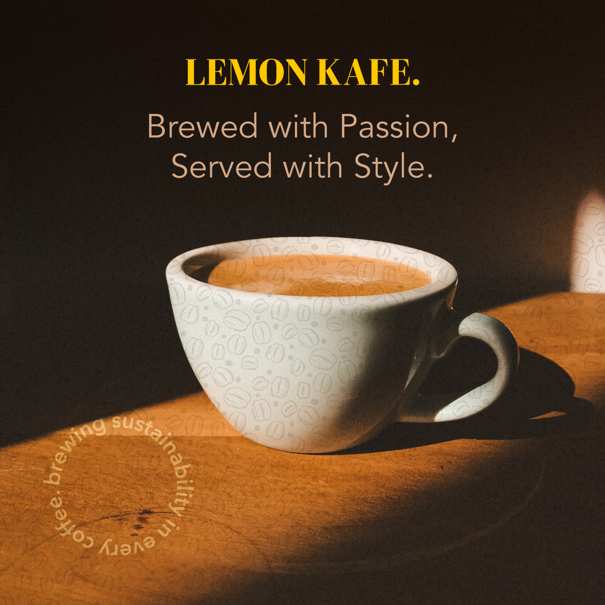
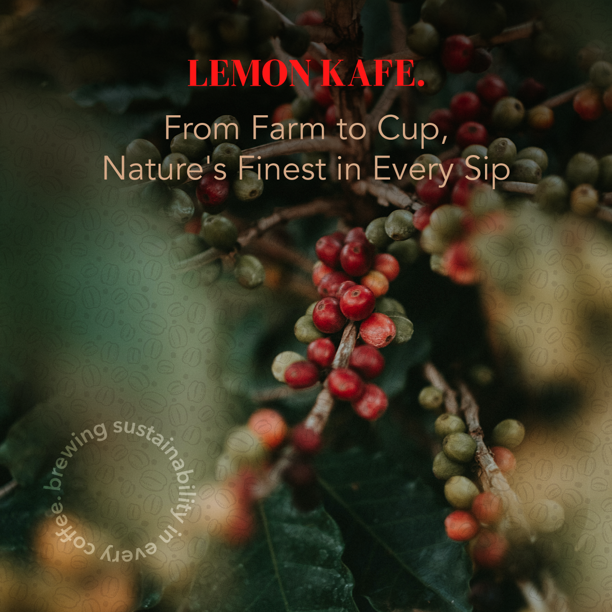
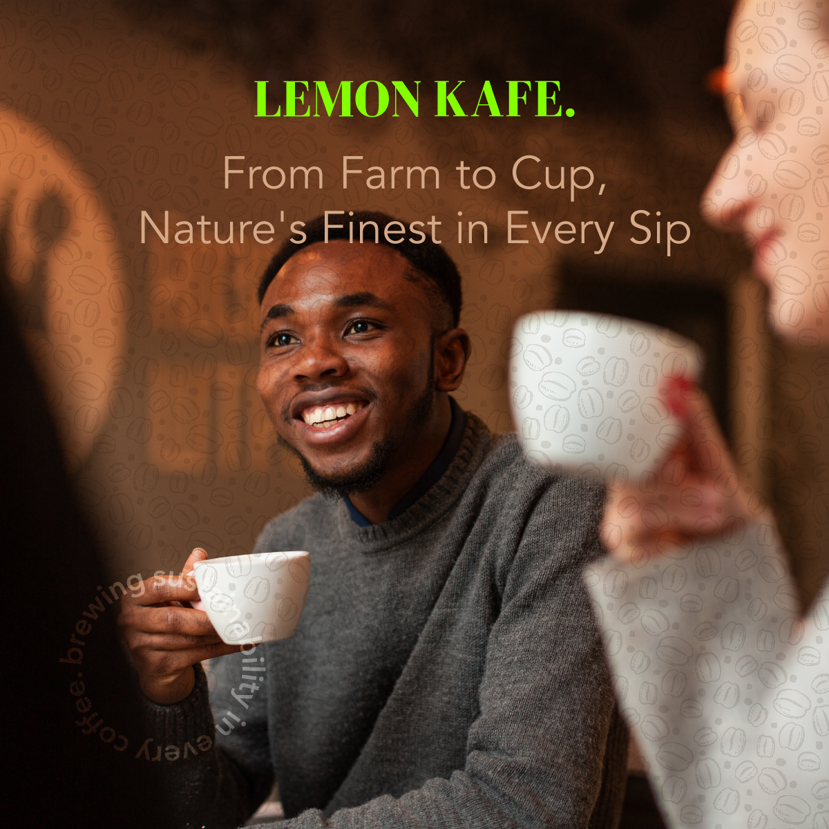
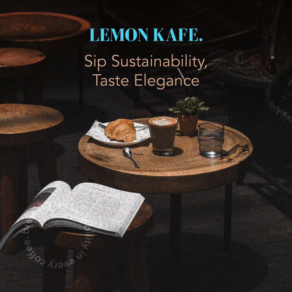
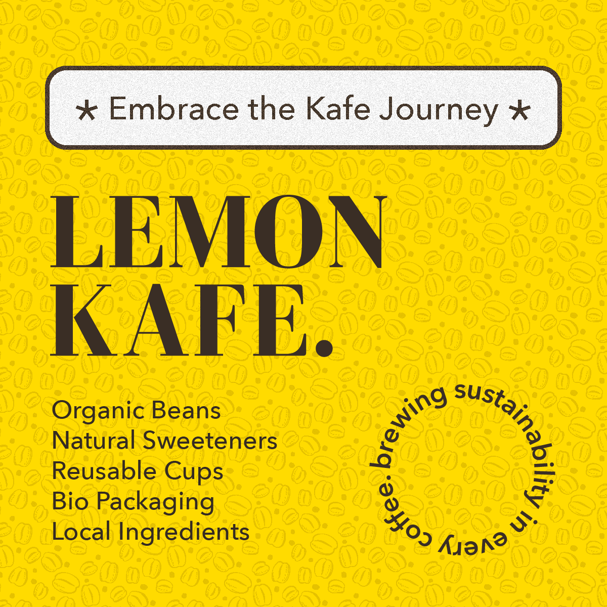
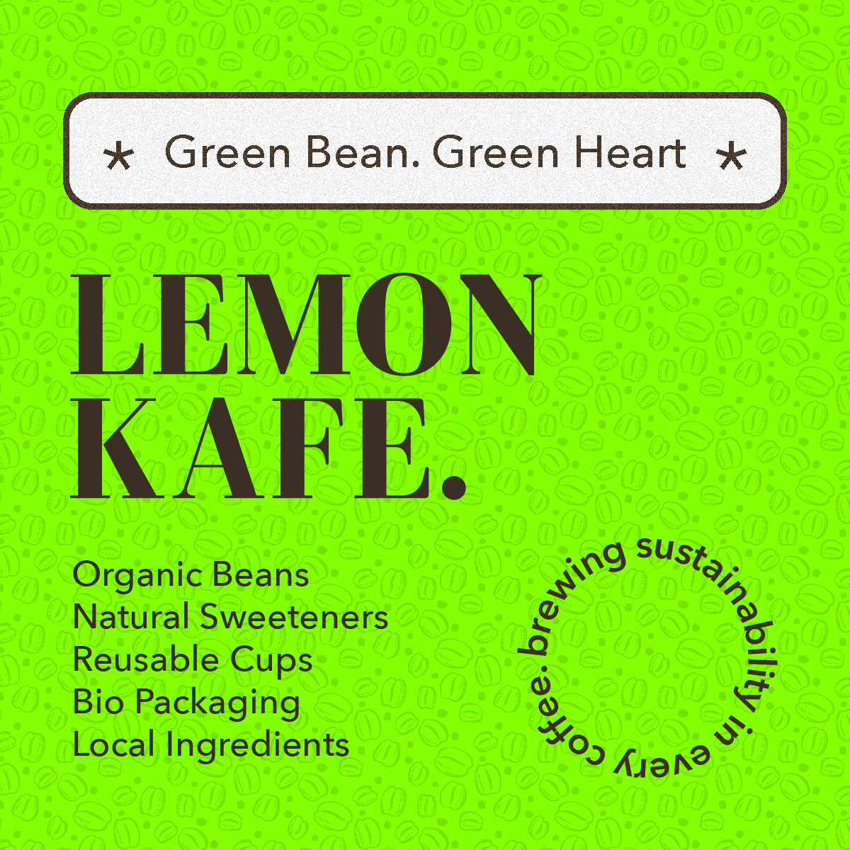
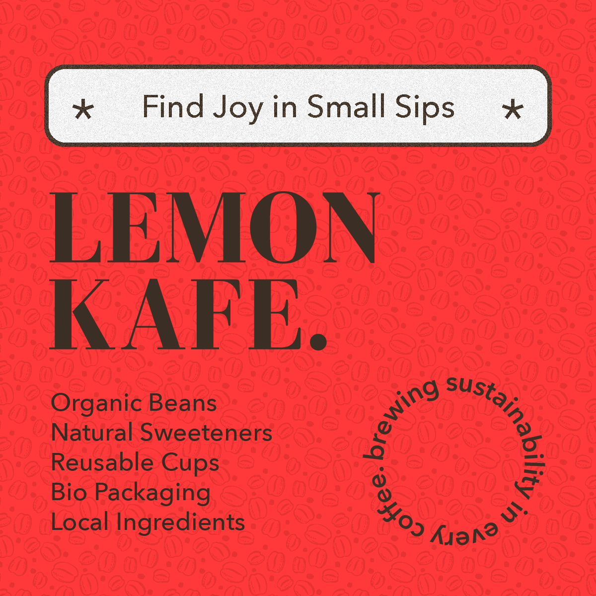
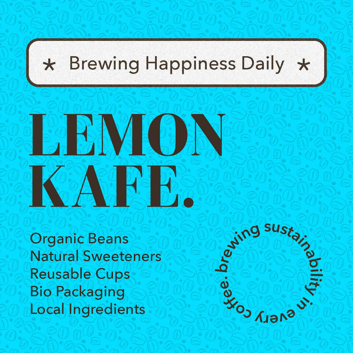
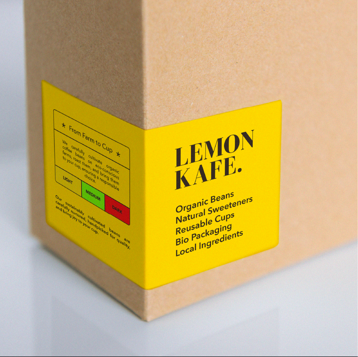
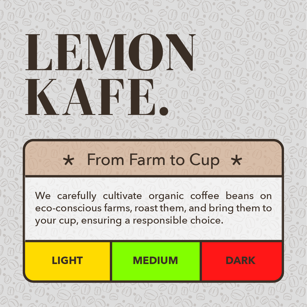
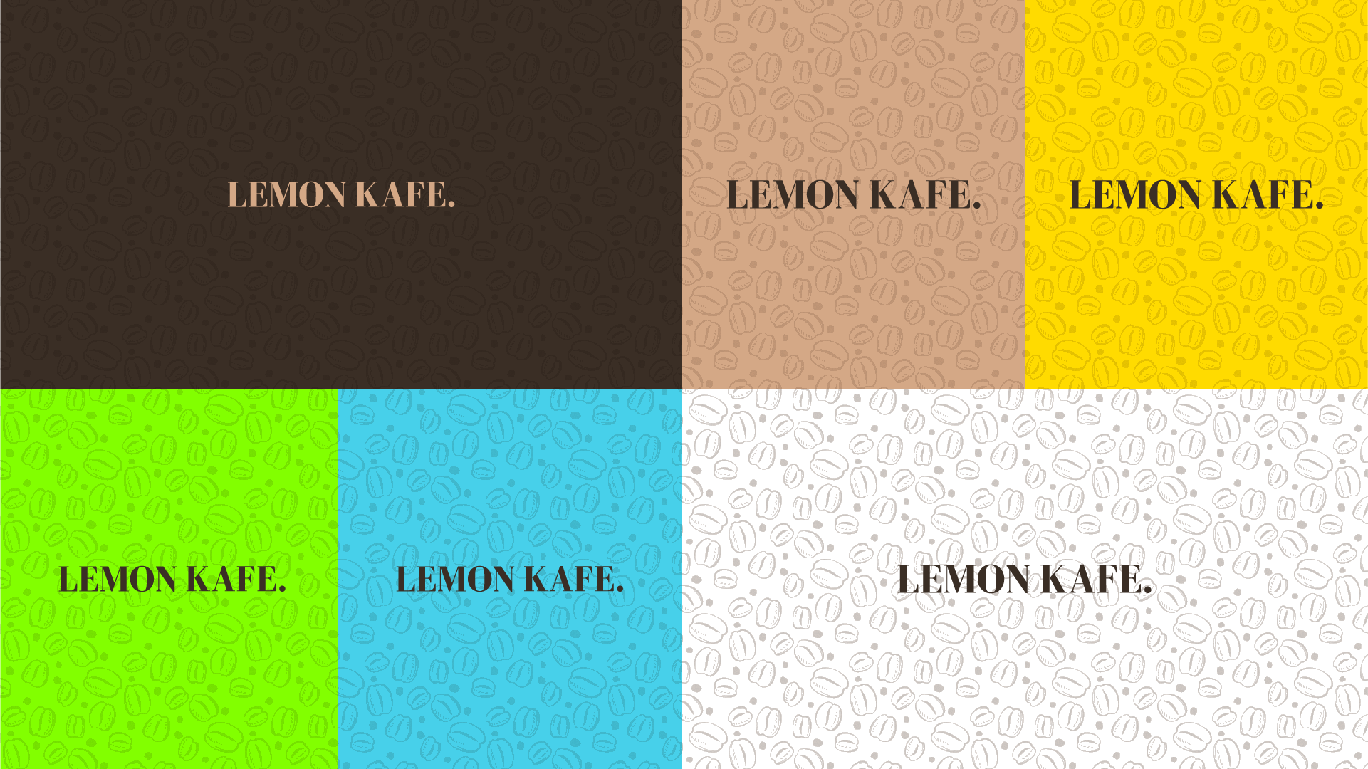
Design Direction
The visual identity combines an organic tone of voice with a vibrant, attention-grabbing palette. Bright neon tones of red, blue, yellow, and green break from eco-brand norms to feel energetic and modern. A playful coffee bean pattern adds personality and reinforces the core product across packaging and digital.
The system is designed to be scalable, clear, and full of life, echoing the brand’s bold, planet-first spirit.


OUTCOME
The branding helped Lemon Kafe launch with a distinct visual presence that immediately set it apart from typical eco-focused coffee shops. The bold color palette and playful identity attracted attention from a younger, values-driven audience. The brand system was easy for the founders to apply across packaging, signage, and digital assets, reinforcing their mission and creating a cohesive, feel-good customer experience.
What
I Learned
- Bright, playful branding can still feel trustworthy when grounded in real values
- Sustainable doesn’t always have to mean beige or minimal
- Organic language matters as much as the logo when it comes to expressing mission