
SECTION 01: INTRODUCTIONSupporting Those Who Serve
The Kingston Military Family Resource Centre (KMFRC) supports military families through major life transitions, from deployment to reintegration, from childhood to youth programs, and beyond. While their services were strong, their communications weren’t.
They faced a fractured system:
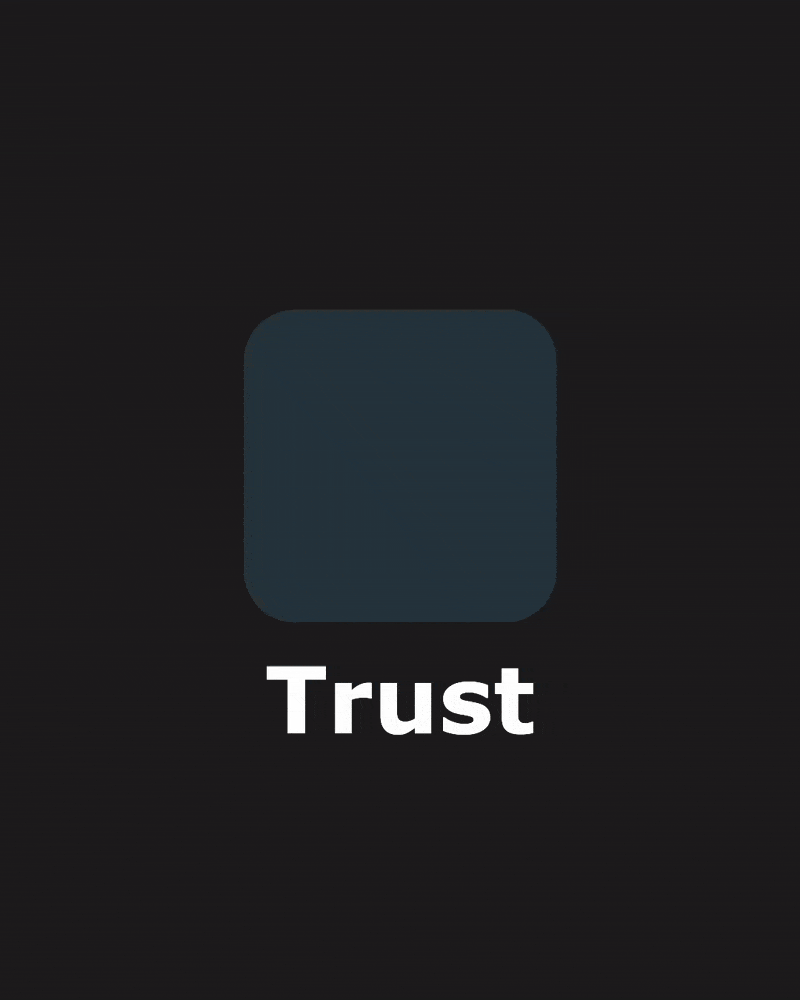
Low Recognition & Trust: Families struggled to identify official KMFRC communications, leading to missed opportunities for vital support during major life transitions.
Wasted Resources: Without shared tools, internal teams spent valuable time reinventing wheels, creating off-brand materials that diluted the organization's message.
Eroded Cohesion: The parent brand and its sub-brands (Les Petits Amis & Youth Matter) felt like separate entities, undermining the sense of a single, supportive community.The result? A lack of trust, low brand recognition, and inefficient internal workflows.
The core challenge was clear: How could we build a cohesive brand system that empowers internal teams, builds trust with families, and unifies the entire organization under one powerful identity?
Partner
Kingston Military Family Resource Centre (KMFRC)
Role
Audited existing brand challenges with an external agency
Built a scalable brand system across 3 tiers: parent brand and 2 sub-brands
Designed an adaptable toolkit for non-designers to create confidently
Led implementation and onboarding across digital, print, and social

Before the ReVamping
SECTION 02: THE CHALLENGEWhy Change Was Needed
The brand faced two key challenges:
– Inconsistent visuals that made it hard for families to recognize KMFRC.
– Disconnected teams creating materials in different styles with no shared system.
Without a unified approach, communication felt scattered, making it harder to build trust and recognition with the people KMFRC serves.
SECTION 03: BRAND STRUCTUREA Connected Ecosystem
KMFRC functions as a parent brand with two key sub-brands: Les Petits Amis (early childhood programs) and Youth Matter (youth-led initiatives). Each serves a different audience with its own tone and needs.
The new system brings them together under one framework. Shared elements like layouts, color accents, and footer design create unity, while the voice, palette, and typography adapt to meet the needs of each audience.

SECTION 04: THE PROCESSFrom Audit to Action
To build a brand that truly served its community, I followed a four-step strategic process:
A clear brand starts with a clear understanding of the people it serves.
Here’s how I built it:
Brand Audit — Worked with an external agency (Spark) to identify gaps in the existing brand and communication challenges.
Audience Research — Leveraged detailed personas created by Spark to guide every visual and verbal decision.
System Design — Developed a cohesive brand system with flexible templates, clear guidelines, and tailored sub-brand identities.
Toolkit Delivery & Onboarding — Provided teams with ready-to-use tools and supported them in adopting the new system.
Everything was designed with the real, everyday experience of staff and families in mind.
Before
Social media posts were created independently by each team, resulting in a mix of different styles.

AFTer
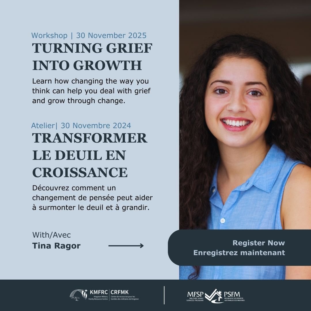
Branded Canva templates now empower all teams to create polished, consistent posts, saving time and strengthening recognition.
SECTION 05: THE SYSTEMColors
The refined color palette improves clarity, ensures accessibility, and creates a consistent look across all materials. Each color has a defined role, making it easy to apply and instantly recognizable as part of the KMFRC brand.


SECTION 05: THE SYSTEMFONT
The type choices were made to create a balance between readability and trust. Verdana, designed for screens, ensures that long passages of text stay clear and easy to read. Georgia adds contrast and structure, giving headings the weight they need to guide users through information. Together, they create a system that feels approachable, organized, and accessible, across both print and digital.


SECTION 05: THE SYSTEMIcons
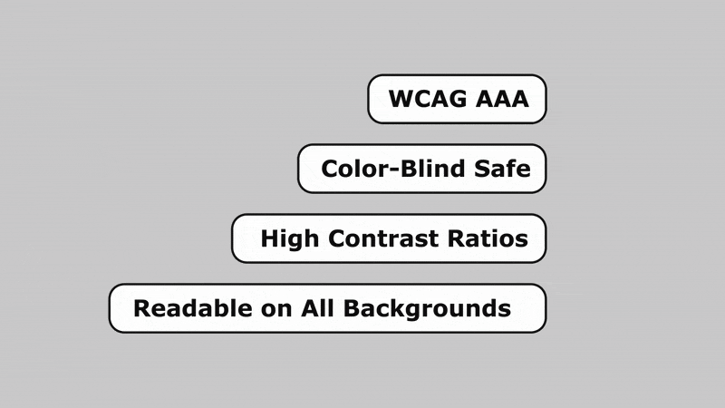
The icon system is designed for clarity, consistency, and accessibility across all platforms.
Using filled shapes and high-contrast colors ensures icons are easy to see and understand for all users, including those with visual impairments.
Optimized for multiple sizes and contexts, the icons support intuitive navigation and improve the overall user experience.


SECTION 6: TEMPLATES IN ACTIONA Flexible System for Everyday Use
To support everyday content creation, I designed a full set of social media templates that offer variety without sacrificing consistency. Each template follows the brand system but allows for different layouts, color combinations, and content hierarchies, making it easy for staff to choose the right tone and structure for the message they’re sharing.
From promoting children’s events to sharing community updates, the system gives teams creative freedom within a clear framework. The result: faster, easier, and more consistent communication across all channels.


Built to ensure that every audience, regardless of ability, can access and understand the content.
Accessible by Design (AODA)


SECTION 07: CANVA SETUP AND WORKFLOWA playground with purpose
To empower KMFRC’s teams, I built a streamlined Canva system—pre-designed templates with locked brand elements (fonts, logos, colors) and flexible layouts. Staff can drag-and-drop content for social posts, flyers, or event graphics while staying on-brand. No design skills needed, just clarity and creative freedom.
→ Streamlined
→ Structured
→ Time-saving
→ Flexible
→ On-brand

SECTION 08: IMPACTA Brand That Works for Everyone
The new KMFRC brand system gave teams what they needed: clarity, consistency, and creative freedom. Materials across programs now feel unified, no matter who makes them. Families can spot KMFRC communications at a glance, and internal teams save time with ready-to-use tools.
With distinct yet connected sub-brands, each audience feels spoken to—and the whole organization now communicates with one strong, recognizable voice.
90% Reduction in Off-Brand Materials: Post-launch, the incidence of inconsistent, one-off designs virtually disappeared, replaced by a cohesive visual identity across all programs.
50% Faster Content Creation: Teams reported spending half the time creating marketing materials, freeing them up to focus on program delivery and community outreach.
45% Increase in Community Connection: Within the first five months, the new brand system drove a 45% lift in overall community engagement. This includes not only social media interactions but also a significant rise in direct inquiries, event sign-ups, and calls for services, showing that the brand's newfound clarity and trust inspired families to take action.